

The modern inbox is no longer a quiet space—it’s a high-competition marketplace. According to email platform benchmarks, an average professional receives 120+ emails per day, yet less than 20% are ever opened.
This is exactly where newsletter design becomes a brand’s silent differentiator. Beyond catchy subject lines and copy, smart email layout, visual hierarchy, typography, colour contrast, and CTA placement decide whether your message gets attention or gets archived.
As an industry expert working closely with brand communication and digital design, one pattern is clear—brands that use to invest in strategic newsletter design see stronger click-through rates, better recall, and higher customer lifetime value. Think about it: your newsletter is often the only branded touchpoint landing directly in your audience’s personal space. If it looks cluttered, outdated, or off-brand, trust drops instantly.
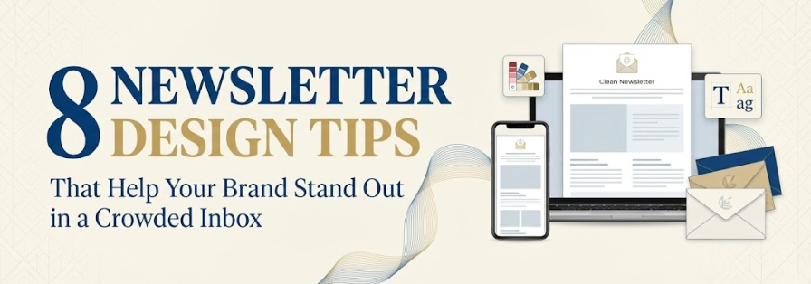
That said, great newsletter design doesn’t mean flashy graphics everywhere. It means balancing brand consistency, mobile-first design, visual storytelling, and scannability—while subtly guiding readers to act. In this blog, we break down 8 proven newsletter design tips that help your brand rise above the noise and truly stand out in today’s crowded inbox.
Table of Contents
How to Design a Newsletter That People Actually Want to Read
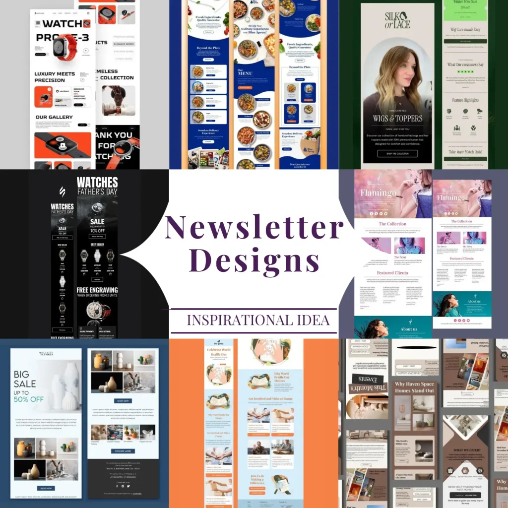
A well-designed newsletter is not just about looking good—it’s about making content effortless to consume and motivating readers to take action. In a world where inbox attention spans are shrinking, a thoughtfully designed newsletter can turn casual message opening into consistent engagement. Here’s how to get it right.
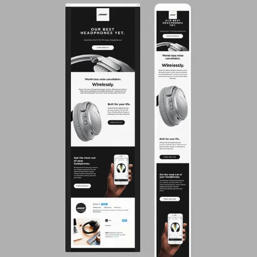
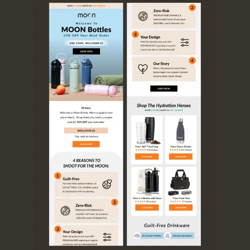
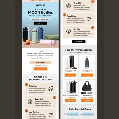
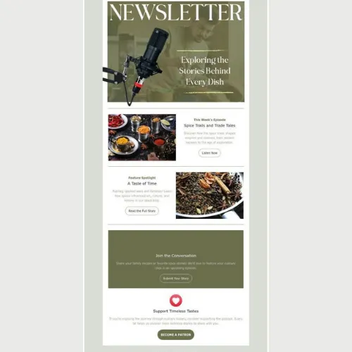
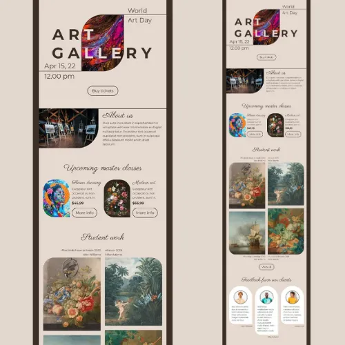
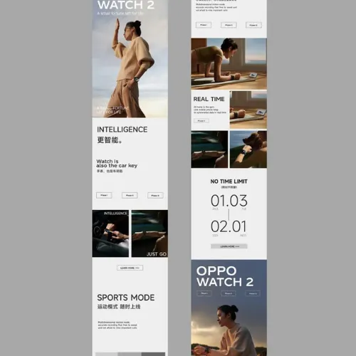
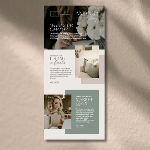
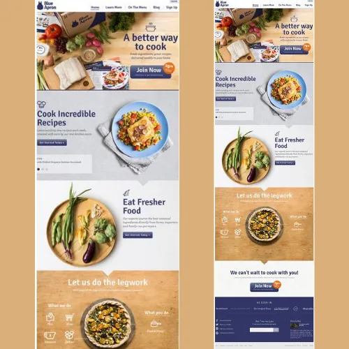
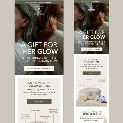
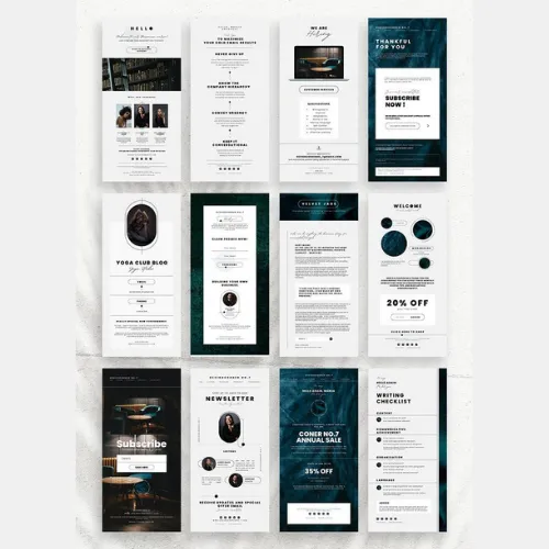
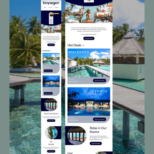
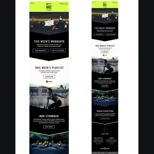
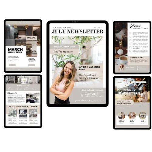
Tip 1: Start With a Clean, Skimmable Layout
Clutter kills attention. A clean layout with ample white space allows readers to scan quickly and understand your message without effort. Break content into short sections, use clear headings, and limit the number of content blocks per scroll. When readers instantly see what’s important, they’re far more likely to stay and read.
Source:https://in.pinterest.com/
Source:https://in.pinterest.com/
Source:https://in.pinterest.com/
Source:https://in.pinterest.com/
Source:https://in.pinterest.com/
Source:https://in.pinterest.com/
Source:https://in.pinterest.com/
Source:https://in.pinterest.com/
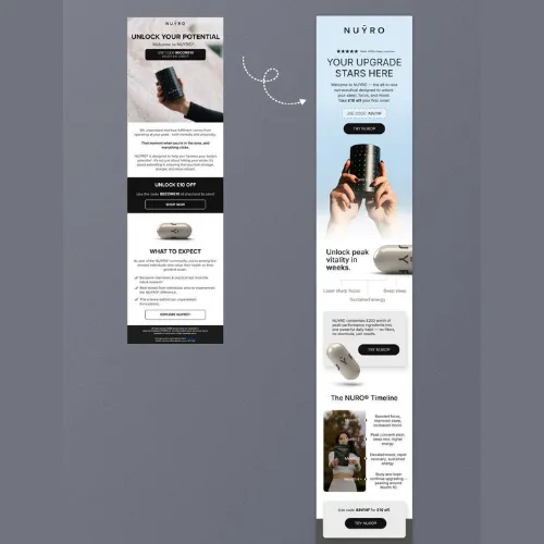
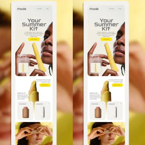
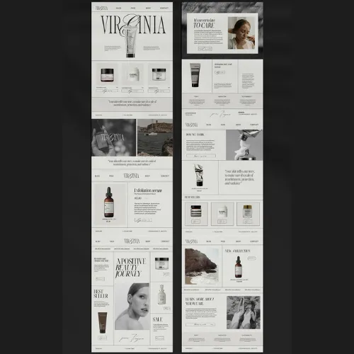
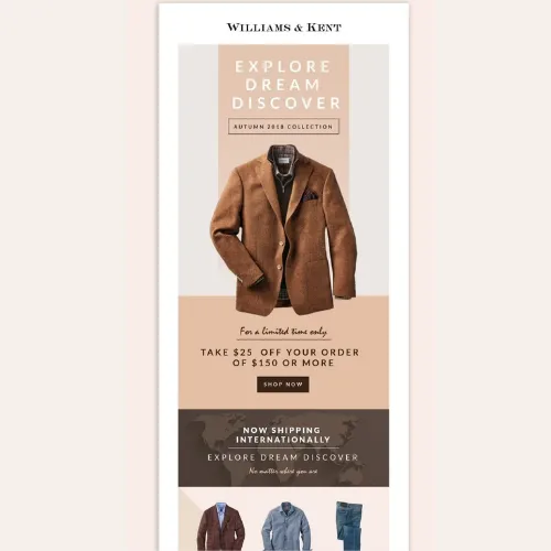
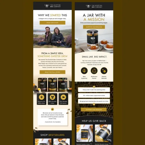
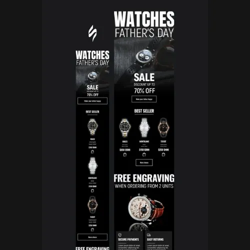
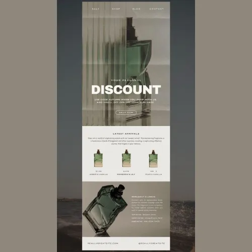
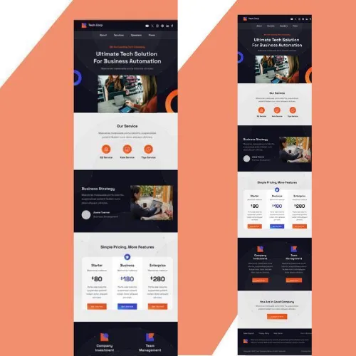
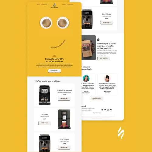
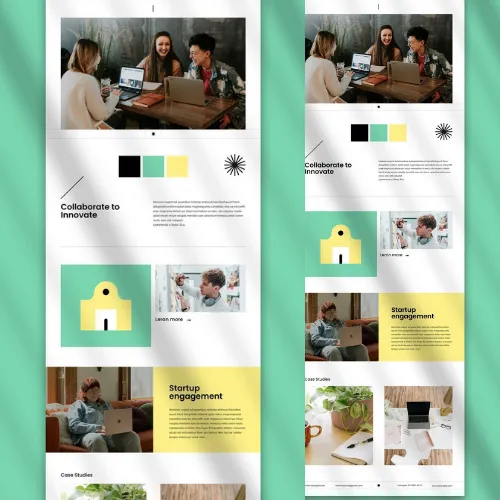
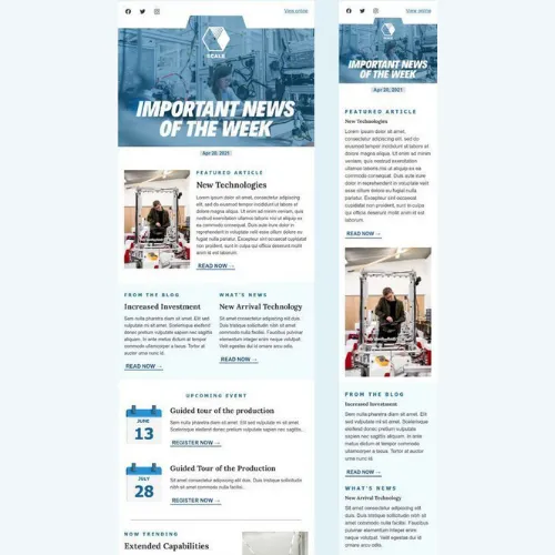
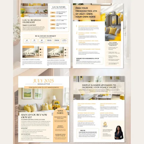
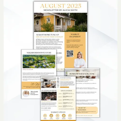
Tip 2: Choose Brand-Centric Colors That Guide the Reader
Color isn’t decoration—it’s direction. Use brand-aligned color palettes to highlight key areas such as headlines, links, and CTAs. Subtle contrasts can draw the eye naturally from top to bottom. Avoid using too many shades, as visual overload can dilute brand recall and reduce readability.
Source:https://in.pinterest.com/
Source:https://in.pinterest.com/
Source:https://in.pinterest.com/
Source:https://in.pinterest.com/
Source:https://in.pinterest.com/
Source:https://in.pinterest.com/
Source:https://in.pinterest.com/
Source:https://in.pinterest.com/
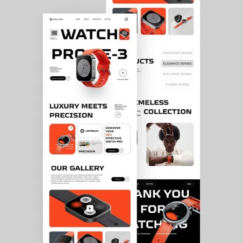
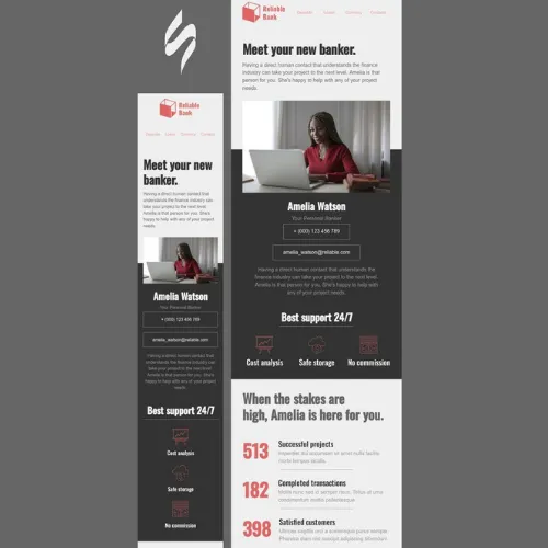
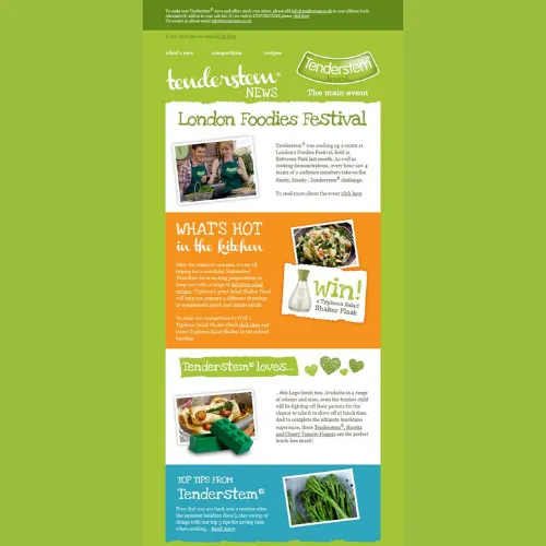
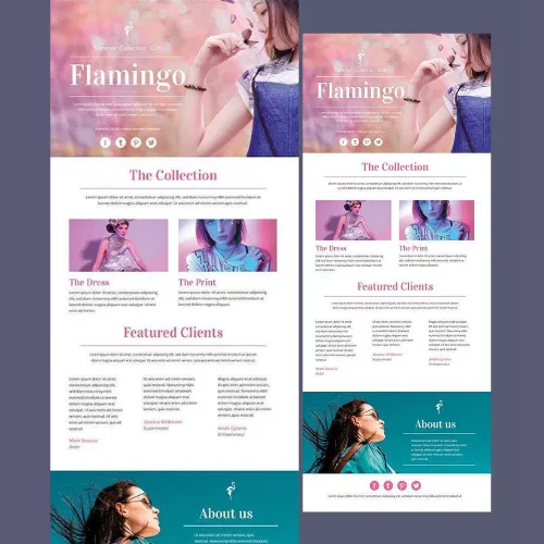
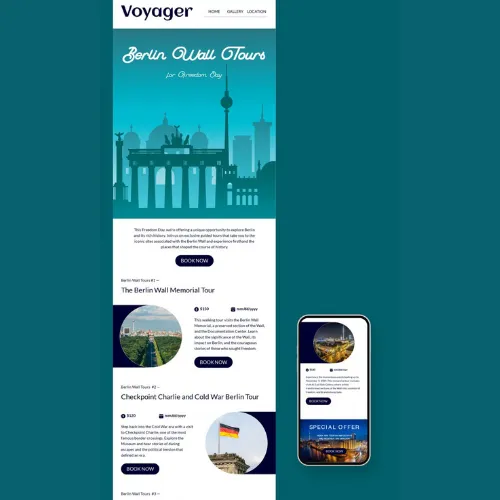
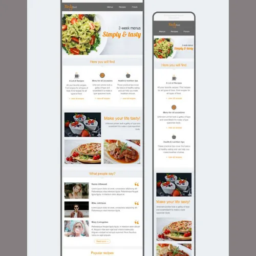
Tip 3: Add Visual Hierarchy With Typography
Typography plays a major role in email readability. Use different font sizes and weights to establish hierarchy—bold for headlines, medium for subheads, and simple body text for easy reading. Stick to one or two fonts to maintain consistency and ensure your message flows smoothly across devices.
Source:https://in.pinterest.com/
Source:https://in.pinterest.com/
Source:https://in.pinterest.com/
Source:https://in.pinterest.com/
Source:https://in.pinterest.com/
Source:https://in.pinterest.com/
Source:https://in.pinterest.com/
Source:https://in.pinterest.com/
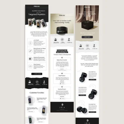
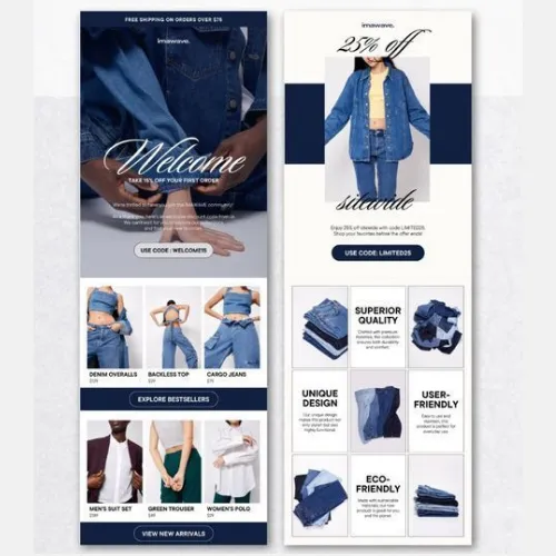
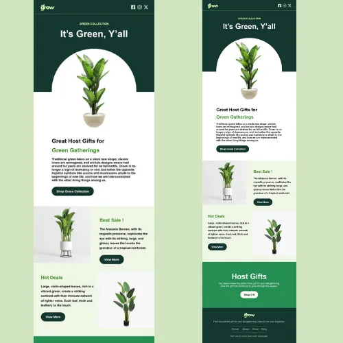
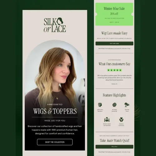
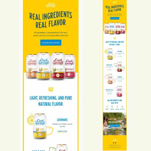
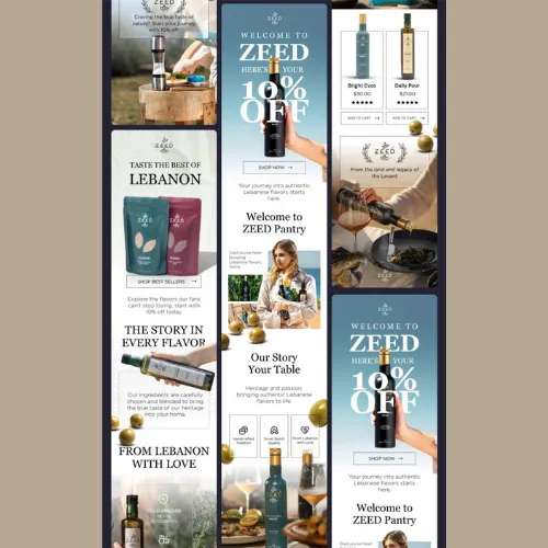
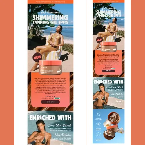
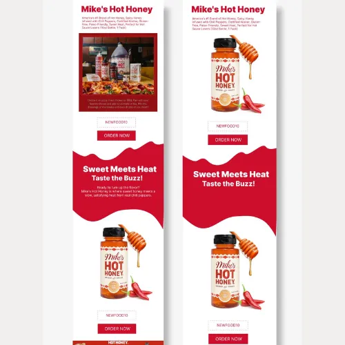
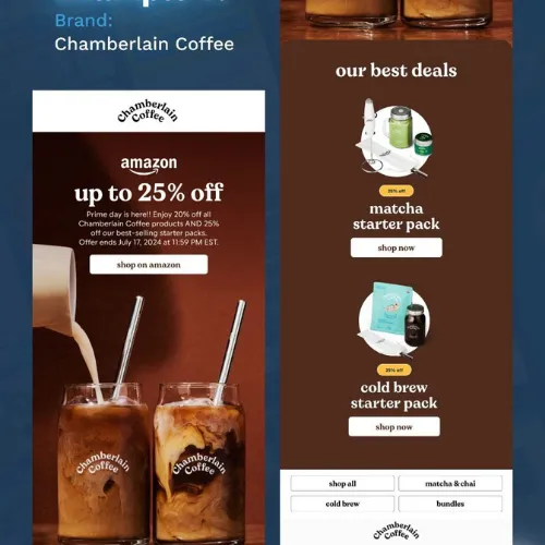
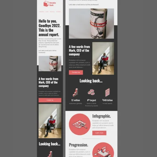
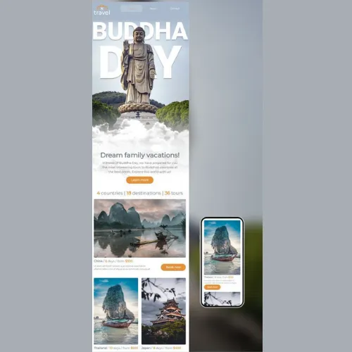
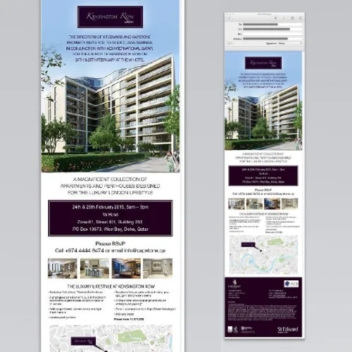
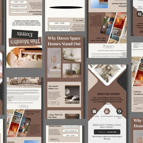
Tip 4: Use High-Quality Graphics and Brand Imagery
Low-quality visuals can damage your brand perception instantly. Try to Use sharp, well-optimized images that well align with your brand tone and message. Custom illustrations, product visuals, or lifestyle imagery help break up text while reinforcing your visual identity and professionalism.
Source:https://in.pinterest.com/
Source:https://in.pinterest.com/
Source:https://in.pinterest.com/
Source:https://in.pinterest.com/
Source:https://in.pinterest.com/
Source:https://in.pinterest.com/
Source:https://in.pinterest.com/
Source:https://in.pinterest.com/
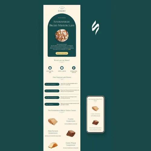
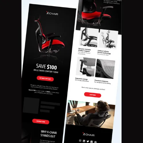
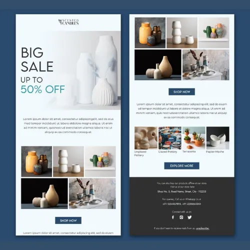
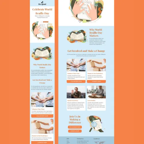
Tip 5: Craft Bold, Action-Driven CTAs
Your CTA is where design meets conversion. Buttons should be visually distinct, clearly worded, and placed strategically within the layout. Action-oriented phrases like “Explore the Collection” or “Get the Free Guide” work far better than generic terms. Make sure CTAs are easy to tap, especially on mobile.
Source:https://in.pinterest.com/
Source:https://in.pinterest.com/
Source:https://in.pinterest.com/
Source:https://in.pinterest.com/
Source:https://in.pinterest.com/
Source:https://in.pinterest.com/
Source:https://in.pinterest.com/
Source:https://in.pinterest.com/
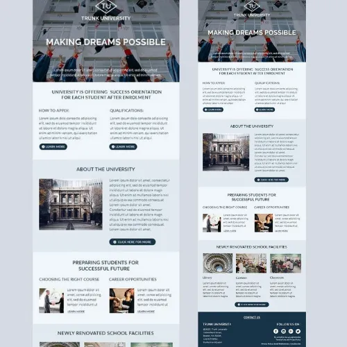
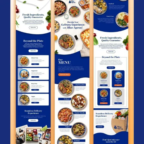
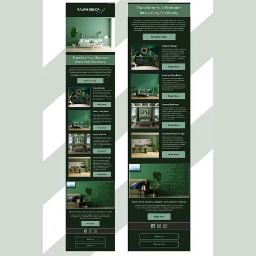
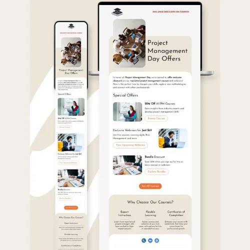
Tip 6: Make Your Newsletter Fully Mobile-Responsive
Over 60% of emails are opened on mobile devices. If your newsletter doesn’t adapt seamlessly to smaller screens, engagement drops instantly. Use responsive grids, legible font sizes, and touch-friendly buttons to ensure a smooth reading experience across all devices.
Source:https://in.pinterest.com/
Source:https://in.pinterest.com/
Source:https://in.pinterest.com/
Source:https://in.pinterest.com/
Source:https://in.pinterest.com/
Source:https://in.pinterest.com/
Source:https://in.pinterest.com/
Source:https://in.pinterest.com/
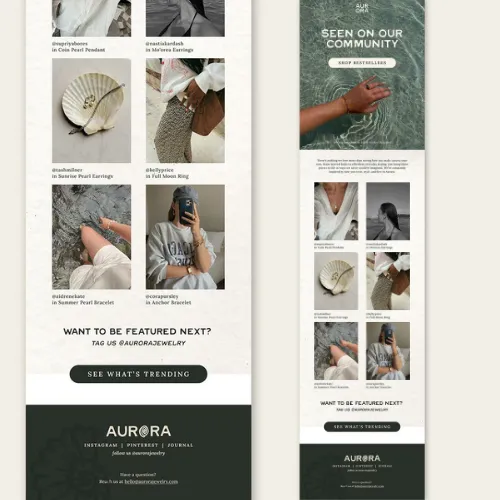
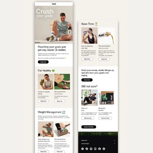
Tip 7: Personalize the Experience With Dynamic Content
Personalisation goes beyond adding a name in the subject line. Segment your audience and show content that matches their preferences, location, or previous actions. Dynamic content blocks make newsletters feel relevant, increasing open rates and click-through performance significantly.
Source:https://in.pinterest.com/
Source:https://in.pinterest.com/
Source:https://in.pinterest.com/
Source:https://in.pinterest.com/
Tip 8: Stay Consistent With Your Branding
Consistency builds trust. From colors and fonts to tone of voice, every newsletter should instantly feel like your brand. A familiar design not only improves recall but also strengthens long-term engagement with your audience.
When done right, newsletter design becomes a powerful brand touchpoint—one readers actually look forward to opening.
Source:https://in.pinterest.com/
Source:https://in.pinterest.com/
Source:https://in.pinterest.com/
Source:https://in.pinterest.com/
Conclusion:
Standing out in a crowded inbox takes more than catchy subject lines—it demands thoughtful, strategic newsletter design that respects the reader’s time and attention. From clean layouts and brand-led colours to strong typography and mobile responsiveness, each design choice plays a direct role in how your message is perceived and acted upon. When these elements work together, newsletters stop feeling like promotions and start feeling like valuable brand conversations.
This is exactly where professional design expertise makes a difference. At LogoPeople, we help brands craft newsletter designs that align with their visual identity, communicate clearly, and drive measurable engagement. Whether you’re building an email campaign from scratch or refining an existing one, the right design approach can transform performance.
Consistency, clarity, and creativity are what keep readers coming back. By applying these 8 newsletter design tips, your emails won’t just land in inboxes—they’ll earn attention, clicks, and trust over time.
Author: Megha Malik

As a passionate entrepreneur and creative brand consultant with experience of 14 years in digital, branding and packaging industry, it is my honest effort to put my experiences and knowledge of industry towards readers. A chartered accountant by degree but a marketing personality in blood has motivated her to take in designing industry as a career. With her fun-loving personality and sharp branding skills, she is a great motivational speaker on her YouTube channel, an active member in various business channels offline as well as online. Do connect me personally via my LinkedIn and I love to share my expertise with you.