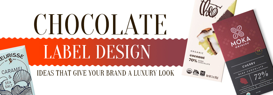
So When it comes to chocolate, the taste is just half the story—packaging tells the other half. A well-designed chocolate label doesn’t just protect your product; it elevates your brand’s perception and can boost product sales by up to 30%, according to packaging industry reports. Luxury chocolate brands, from artisanal truffles to premium bars, know that a sophisticated label instantly communicates quality and indulgence.
But crafting a label that captures both elegance and brand identity isn’t easy. This is where inspiration plays a key role. With 142+ chocolate label design ideas created with creative appeal, you’ll discover how color palettes, typography, and foil stamping can transform your chocolate from ordinary to irresistible.
Whether you’re a startup or an established brand, these ideas will guide you to create labels that not only look luxurious but also speak directly to chocolate lovers’ emotions—turning first impressions into loyal customers.
Table of Contents
How does a thoughtful label design give a chocolate-branded look?
A thoughtful label design does more than just identify your product—it actually gives your brand a premium, 142+ Chocolate Label Design Ideas that Give Your Brand a Luxury Look memorable look that resonates with consumers. Labels are often the first touchpoint between a chocolate brand and its audience, and research shows that over 70% of purchasing decisions are influenced by packaging. Elements like thoughtful typography, brand rich color palettes, textured finishes, and subtle gold or silver foiling can instantly convey luxury and quality.
A well-crafted label also communicates your brand story with your targeted audience, whether it’s artisanal craftsmanship, organic ingredients, or heritage recipes, building trust and emotional connection. In crowded market shelves, a well designed label sets your chocolate brand apart from your competitors that make it recognizable and desirable.
From minimalist designs that emphasize sophistication to intricate visuals that reflect indulgence, every design choice plays a role in shaping perceptions, turning a simple chocolate bar into a premium experience your customers can’t resist.
Design Toolkit of a Luxury Chocolate Label that Makes it Crowd Attractive
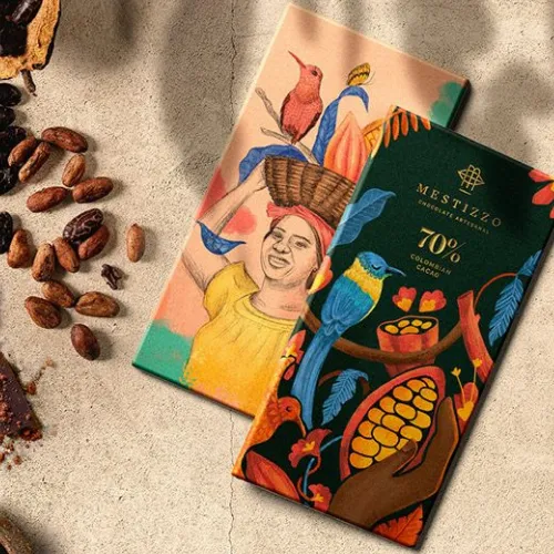
A luxury chocolate label isn’t just about looking pretty—it’s about creating an quick brand connection with consumers. Every design element, from brand font to it’s material finish that plays a crucial role in conveying quality, indulgence, and brand story.
A thoughtfully designed label can create your chocolate irresistible on crowded shelves and elevate your brand perception. Here’s a breakdown of the essential design toolkit for a crowd-attractive chocolate label:
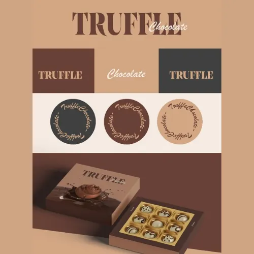
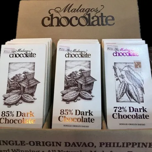
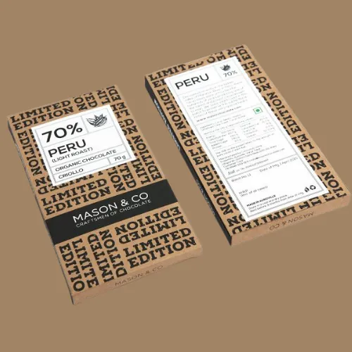
1- Typography Choices
Fonts are the real king that set the personality of your chocolate brand. So always try to use fonts like san-serif or poppins fonts that will communicate luxury and clean typefaces attract more audience towards your chocolate brand. Combining headline and body fonts strategically creates visual harmony.
Source:https://in.pinterest.com/
Source:https://in.pinterest.com/
Source:https://in.pinterest.com/
Source:https://in.pinterest.com/
Source:https://in.pinterest.com/
Source:https://in.pinterest.com/
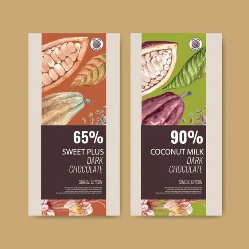
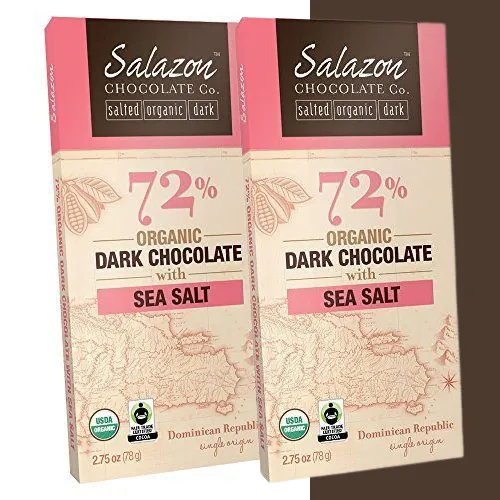
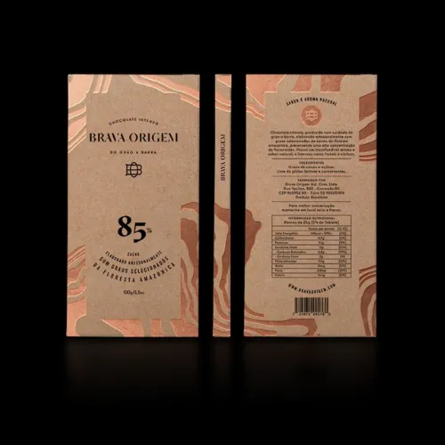
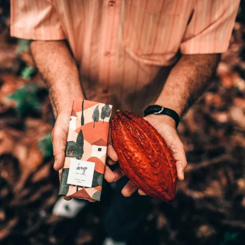
2- Color Palettes
Colors evoke emotions. Deep browns, gold, burgundy, and jewel tones signal premium quality towards your brand. Also soft pastels on your label can add a sophisticated, premium feel. Harmonious combinations make the label stand out instantly.
Source:https://in.pinterest.com/
Source:https://in.pinterest.com/
Source:https://in.pinterest.com/
Source:https://in.pinterest.com/
Source:https://in.pinterest.com/
Source:https://in.pinterest.com/
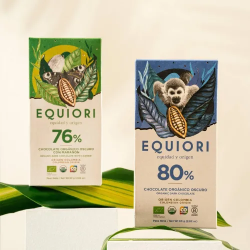
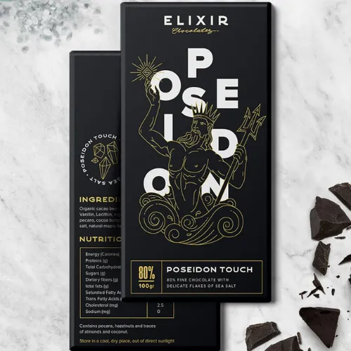
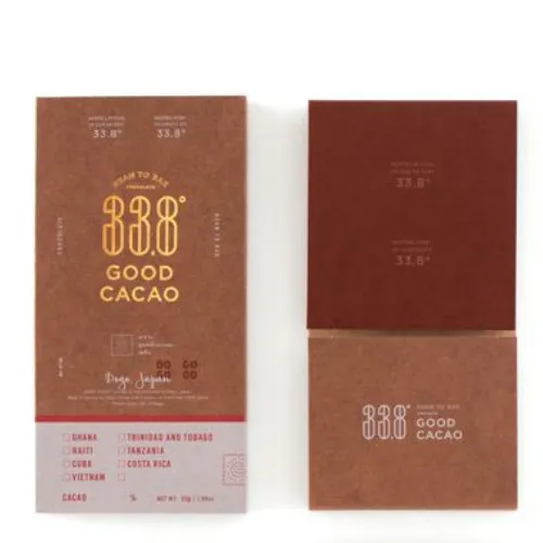
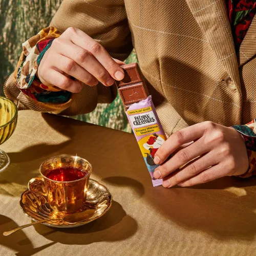
3- Material & Finish
The tactile experience matters as much as visual presence. Finish of material like, Matte, textured paper, foil stamping, embossing, or gloss finishes set the perceived value of your product and create a premium touchpoint towards your brand.
Source:https://in.pinterest.com/
Source:https://in.pinterest.com/
Source:https://in.pinterest.com/
Source:https://in.pinterest.com/
Source:https://in.pinterest.com/
Source:https://in.pinterest.com/
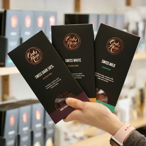
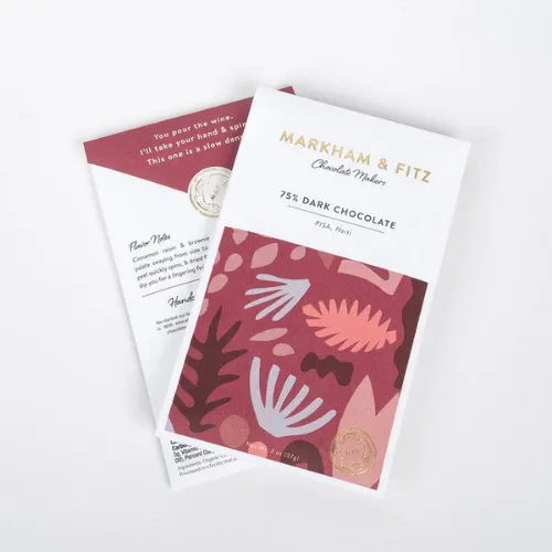
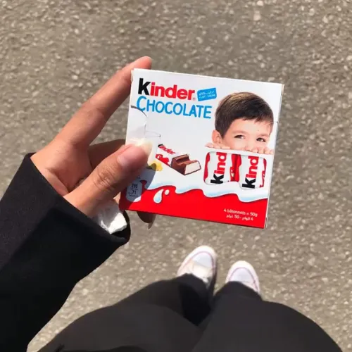
4- Logo Placement and Brand Identity
Prominent logo positioning on your label ensures brand recognition. That’s why your logo design should always be complement of the design and reflect it’s brand personality clearly without overpowering other design elements.
Source:https://in.pinterest.com/
Source:https://in.pinterest.com/
Source:https://in.pinterest.com/
Source:https://in.pinterest.com/
Source:https://in.pinterest.com/
Source:https://in.pinterest.com/
5- Information Hierarchy
Organize content logically—brand name first, product type next, followed by ingredients or certifications. Clear hierarchy guides the eye and enhances usability.
With these elements, your chocolate label design gives a luxurious experience that draws consumers effortlessly.
Source:https://in.pinterest.com/
Source:https://in.pinterest.com/
Source:https://in.pinterest.com/
Source:https://in.pinterest.com/
Source:https://in.pinterest.com/
Source:https://in.pinterest.com/
Tips for Creating Your Own Luxury Chocolate Label
Creating a luxury chocolate label is an art and a strategy combined. Your label design is the first impression customers have of your brand that’s why a deep researched and well-designed can instantly set your brands perceived value. This in result encourage purchases, and build brand loyalty. Here are practical tips to craft a label that truly feels premium:
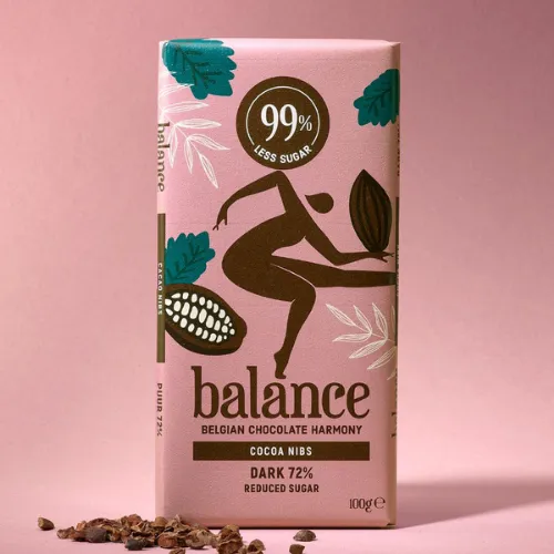
a) Choosing the Right Color Palette to Evoke Premium Perception
Colors influence emotions and perceptions. That’s why a well researched brand colours Deep, rich hues like dark chocolate brown, gold, burgundy, and emerald green communicate sophistication and luxury.
Source:https://in.pinterest.com/
Source:https://in.pinterest.com/
Source:https://in.pinterest.com/
Source:https://in.pinterest.com/
Source:https://in.pinterest.com/
Source:https://in.pinterest.com/
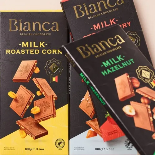
b) Selecting Fonts that Match Brand Personality
Typography conveys your brand’s story without words. Elegant serif fonts, cursive scripts, or minimalist sans-serifs can all signal different facets of luxury. Make sure the font aligns with your brand personality—whether it’s classic, modern, or artisanal—and is readable at a glance.
Source:https://in.pinterest.com/
Source:https://in.pinterest.com/
Source:https://in.pinterest.com/
Source:https://in.pinterest.com/
c) Using Textures and Finishes to Create a Tactile Experience
Luxury isn’t just visual—it’s physical. Materials like matte, textured paper, embossed elements, or foil stamping make the label feel premium to the touch. These finishes create a sensory connection that makes customers more likely to perceive the product as high-end.
Source:https://in.pinterest.com/
Source:https://in.pinterest.com/
Source:https://in.pinterest.com/
Source:https://in.pinterest.com/
d) Ensuring Label Information is Clear but Elegant
Luxury packaging balances aesthetics and functionality. Organize information hierarchically: brand name first, product type next, and supporting details like ingredients, certifications, or origin last. Maintain clarity without clutter, keeping elegance in every element.
Source:https://in.pinterest.com/
Source:https://in.pinterest.com/
Source:https://in.pinterest.com/
Source:https://in.pinterest.com/
e) Testing Designs with Target Audience Feedback
Before finalizing, get feedback from your target audience. Small tweaks based on preferences, readability, and visual appeal can dramatically improve the effectiveness of your label.
By following these tips, you can create a chocolate label that not only looks luxurious but connects with your audience, communicates quality, and boosts your brand’s presence.
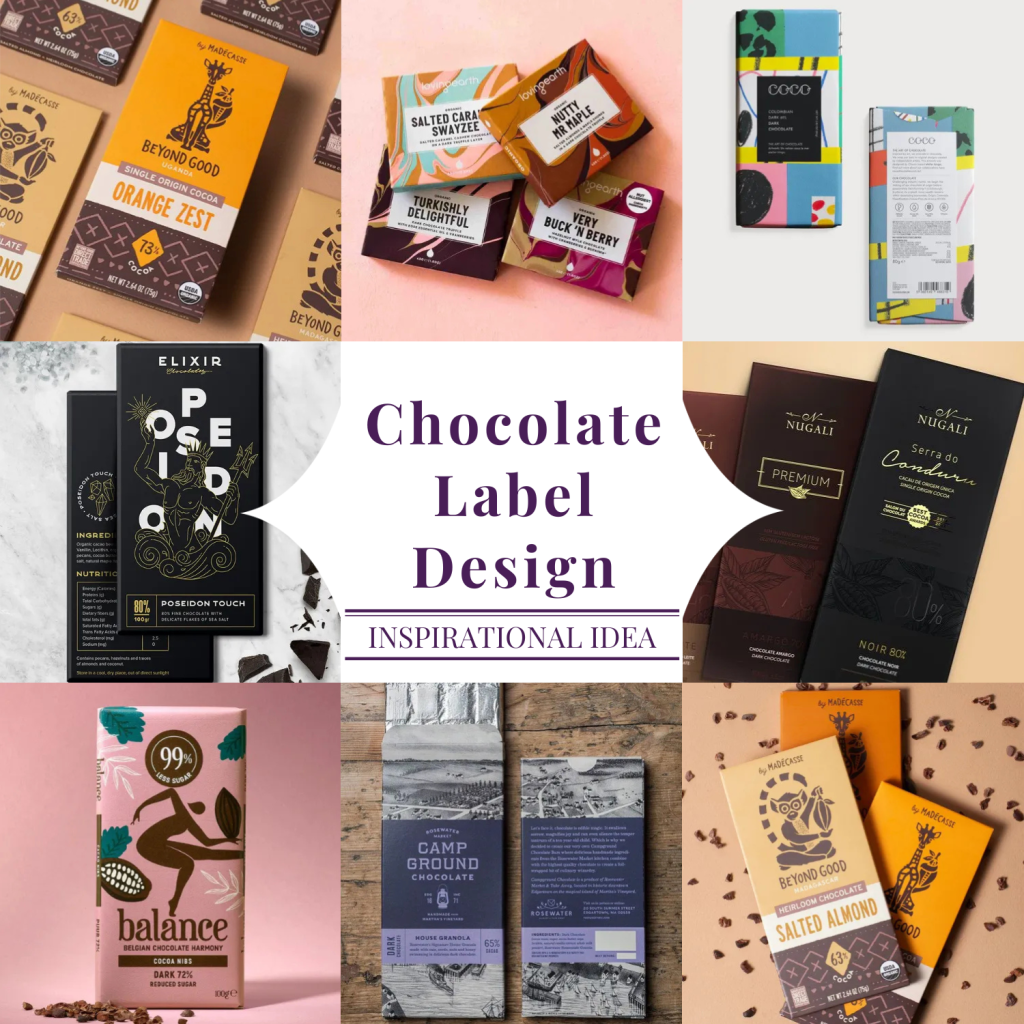
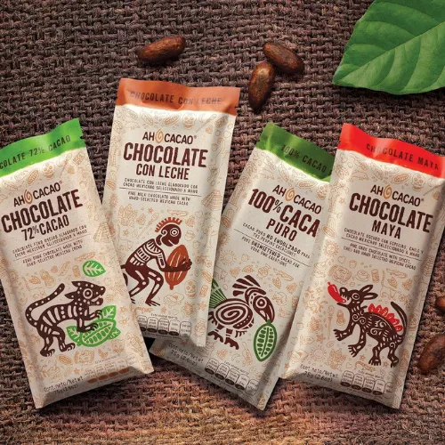
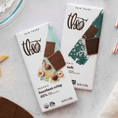
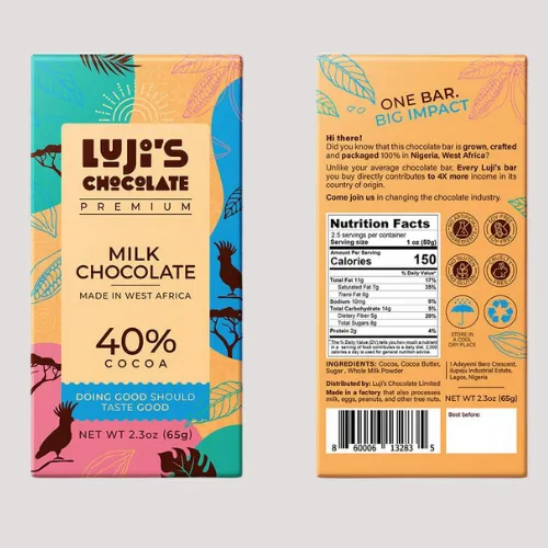
Some Great Designs of Chocolate Labels that Bring Inspiration for Your Brand
Source:https://in.pinterest.com/
Source:https://in.pinterest.com/
Source:https://in.pinterest.com/
Source:https://in.pinterest.com/
Conclusion:
With over 142 chocolate label design ideas explored in this blog, it’s clear that a well-crafted label can significantly elevate your brand’s perception. A luxury look isn’t just about aesthetics; it communicates quality, builds trust, and encourages customers to choose your chocolates over competitors. From minimalist elegance to bold, artistic designs, every detail matters — colors, typography, textures, and finishes all contribute to a memorable unboxing experience.
If you want your chocolate packaging to truly stand out on the shelf and convey premium quality, working with experts can make a difference. LogoPeople specializes in creating custom label designs that perfectly align with your brand identity while appealing to your target audience. Their experience in luxury branding services ensures that every design element is purposeful and impactful.
Take inspiration from these ideas, and don’t hesitate to explore LogoPeople’s services to transform your chocolate brand into a visual delight that captures attention and leaves a lasting impression.
Author: Megha Malik

As a passionate entrepreneur and creative brand consultant with experience of 14 years in digital, branding and packaging industry, it is my honest effort to put my experiences and knowledge of industry towards readers. A chartered accountant by degree but a marketing personality in blood has motivated her to take in designing industry as a career. With her fun-loving personality and sharp branding skills, she is a great motivational speaker on her YouTube channel, an active member in various business channels offline as well as online. Do connect me personally via my LinkedIn and I love to share my expertise with you.